Pebblr — your child's day, beautifully connected.
A daycare communication app — pickup coordination, meals, and privacy-first photos — designed end-to-end and shipped to real daycares.
End-to-end: research, product design, design system, AI-assisted build
Personal product, born from observing 4 family-run daycares
Figma design system as build spec → Claude Code → shipped
Replaced WhatsApp chaos; automated pickups; ephemeral photos
The problem — watched, not assumed
My family runs four daycares. Visiting them, I kept seeing the same three frictions: staff shared children's photos through a WhatsApp group — neither private nor sustainable; parents kept asking what their child ate, with no record anywhere; and my sister spent the end of every day manually texting parents to come for pickup, then waiting with no idea who was on the way.
The "before" state was a patchwork of WhatsApp groups, verbal updates, and repeated questions. Research access most designers never get: I watched the actual workflow, repeatedly, as family.
One WhatsApp group for everything
Every parent sees every child's photos — neither private nor sustainable.
“What did my child eat today?”
Asked every day, answered from memory. No record anywhere.
Manual texts, one parent at a time
End-of-day reminders sent by hand — then waiting, with no idea who's coming.
The before-state — three frictions, observed across four family daycares
Two sides, one loop
Providers get roster, attendance, meal logging, photo sharing, and automated pickup coordination. Parents get daily visibility — meals, photos, reminders — plus "on the way" status and arrival notification. Every feature closes a loop between the two.
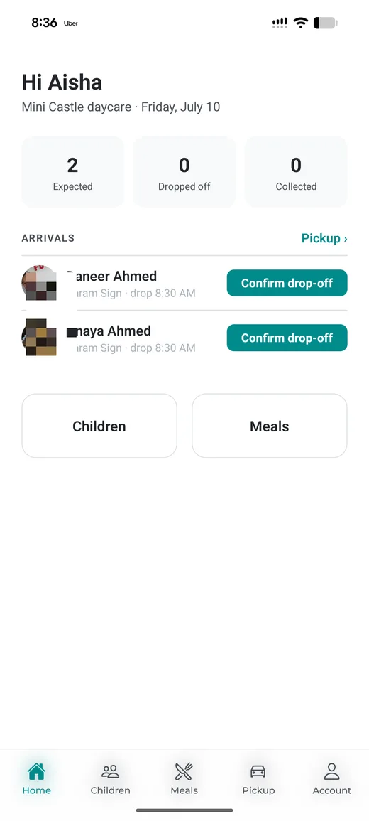
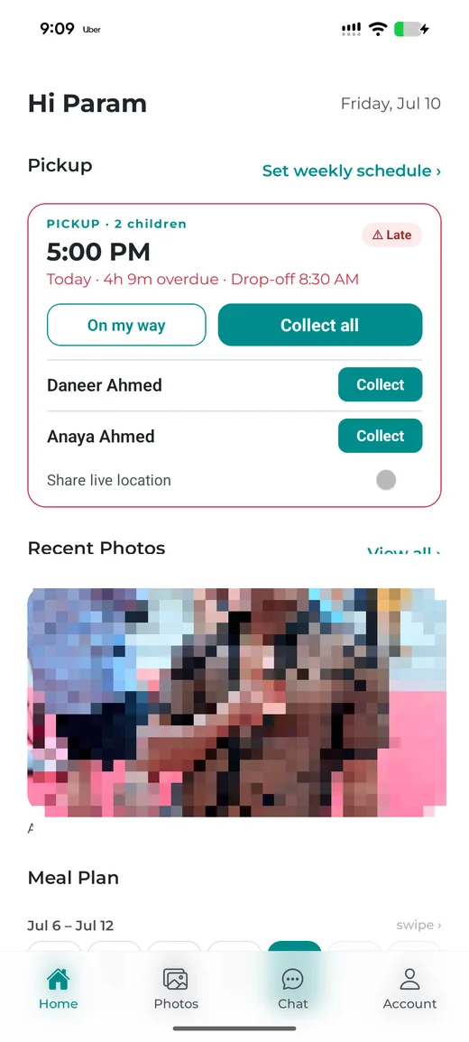
Shipped app — provider home · parent home
Key decisions
Photos that expire: privacy as architecture
Children's photos are the most sensitive data in the product, and a daycare photo's purpose is to share today's moment — not build an archive. Photos go directly from camera to the child's parents, never stored in the provider's phone. They auto-delete after 7 days; saving is the parent's deliberate choice.
Started at 10 days, considered 24 hours — rejected: a Stories-style window deletes photos a shift-working parent never saw. Seven days matches the ephemeral-messaging middle tier (Snapchat, WhatsApp). Every incumbent daycare app accumulates photos forever; where they chose accumulation, Pebblr chose ephemerality.
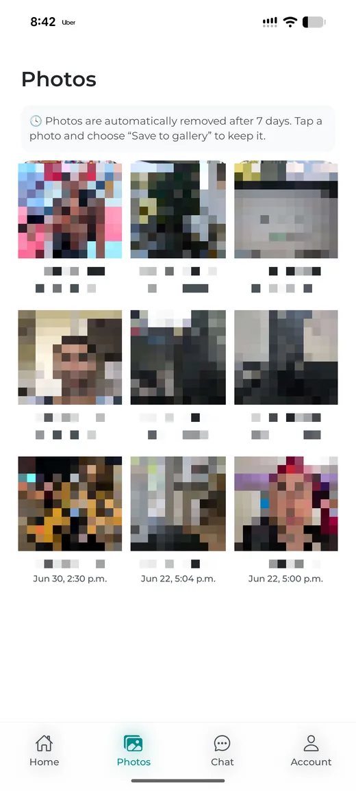
“Photos are automatically removed after 7 days” — the policy, visible in the product
The design system was the build spec
High-fidelity wireframes plus a full design system in Figma — colors, type scale, buttons, forms, alerts, icons, spacing — then the design system itself was handed to Claude Code as the specification for the build. No hand-coding; my role was direction, review, and design authority over every screen.
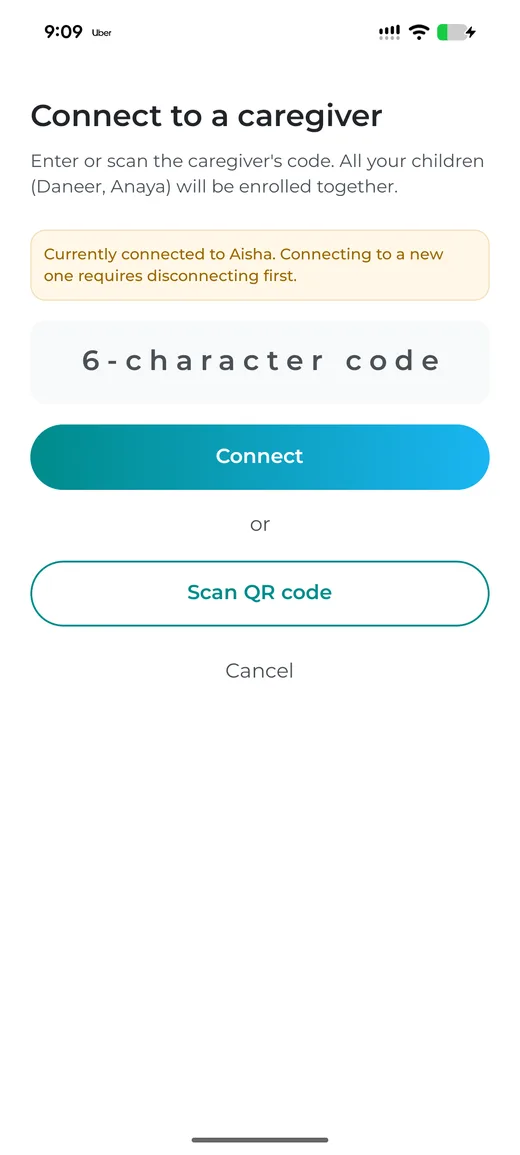
One system, every screen — shipped UI
Pickup as a coordination loop, not a message thread
Automated reminders replace the manual text; parents respond with an "on the way" status the provider sees; parents can notify the daycare before arrival. The provider stops chasing — the app closes the loop.
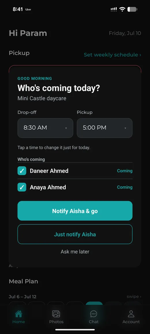
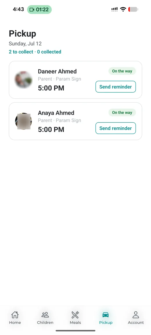
Automated reminder → “on the way” status, provider view
What changed between Figma and the shipped app
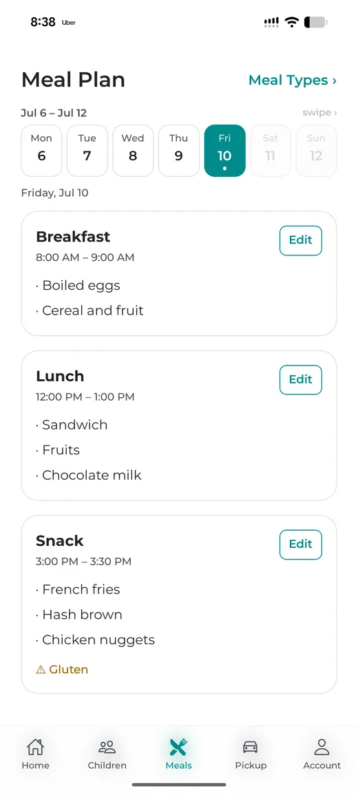
The wireframe put meal-plan date selection on its own screen. In real use that meant jumping through screens for a routine daily task — so the built version puts the dates in a row at the top of the meal plan itself: tap a date, log the meal, done. Fewer screens, less complexity, faster daily use.
Shipped — one screen, date row on top (wireframe had two screens)
Outcomes — a pilot, honestly reported
Provider-side automation is the proven win: the end-of-day pickup texting is gone. Parent-side adoption is uneven — the arrival-notify option gets used sometimes, not always. That honesty matters: it shaped what I'd build next.
“I was tired of sending messages to every parent — some are always late, and I had to remind them to come pick up their children. Now the reminders go automatically, and when a parent taps ‘on my way,’ I know they're coming. They're better on time now, on average.”
— Daycare owner, pilot site #1 (my sister)
What I learned
First: adoption is a habit problem, not a feature problem. My sister's first reaction wasn't relief — it was "another app I have to learn." She had to see the benefit before the habit stuck. Now the automatic reminders and the 'on my way' status are the parts she wouldn't give back.
Second: I underestimated how emotional this product is. I built the photo feature to protect children's privacy — but for parents, that photo is the moment in their day when they stop missing their child. And for my sister, it's what builds trust with parents. A feature can carry a feeling. I know that now.
Third: providers use the app all day, so their habits formed fast. Parents open it less often, so their habits formed slowly — many still forget to tap 'on my way.' That gap is what version two needs to fix: make the app effortless for parents from day one.