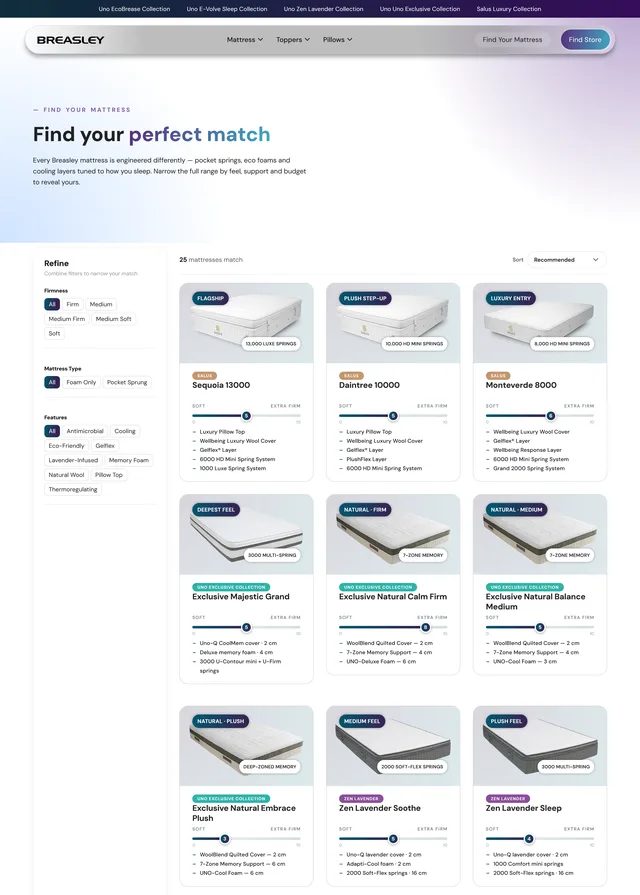
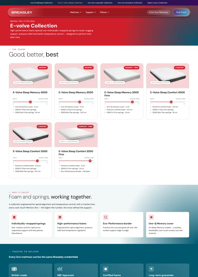
Breasley — one philosophy, two experiences.
A UK mattress manufacturer launched a luxury brand next to its affordable one — and needed a single website to hold both without diminishing either, while serving consumers, commercial buyers, and OEM partners.
Freelance web designer-developer — solo, 10-yr client relationship
Brand architecture, IA, copy, design system, WordPress/Elementor build
Consumers · commercial/contract · white-label OEM
Delivered & paid 2026 · design system + mattress finder where none existed
The trigger — a luxury brand with no home
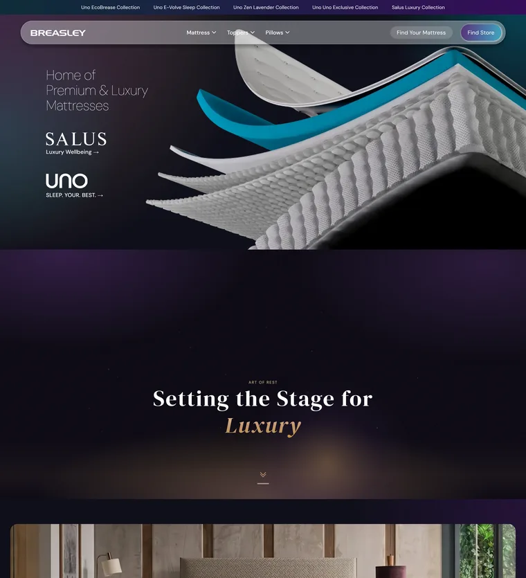
Breasley's site knew only Uno, its affordable line. Then came Salus — luxury wellbeing mattresses with their own colors, typography, and positioning. Two brands at opposite ends of the market now needed one roof: a site that could sell simple comfort and signature luxury without making either feel like the other's discount or markup.
The difference, measured
Not just a visual refresh — the rebuild was audited with Google Lighthouse, the industry-standard web audit: old site against new, run under identical conditions (July 2026).
Homepage
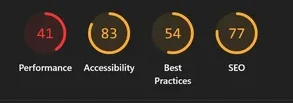



Raw Google Lighthouse captures, cropped to the dials — product page: E-Volve Sleep Comfort 4000
Three audiences, one front door
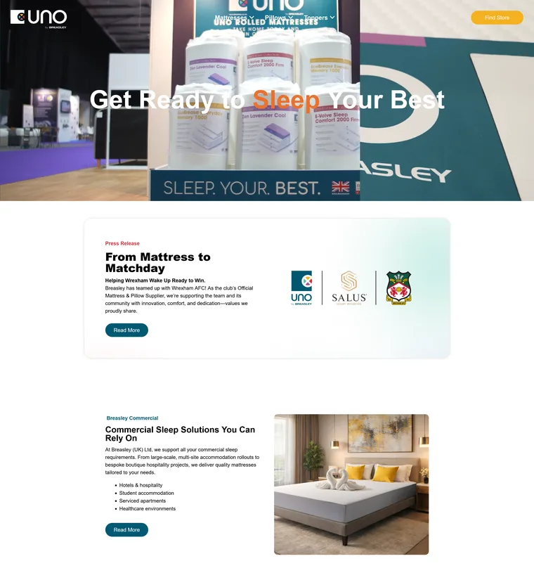
The homepage couldn't be a consumer mattress page — commercial buyers (hotels, student housing, healthcare) and white-label OEM partners needed direct paths too. Decision: the homepage is a routing page. Breasley leads as the umbrella; audiences split before brands do. A 50/50 Uno/Salus split was considered and rejected — it answered the wrong question first.
Homepage as routing page — audiences split before brands do
Never “cheap vs expensive”
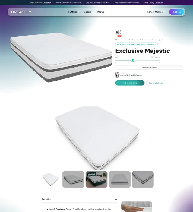
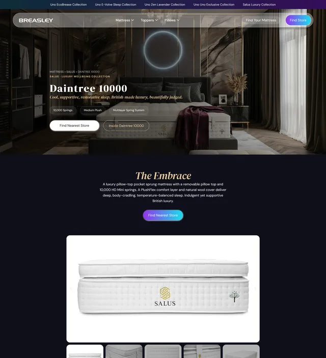
The easiest framing — budget brand vs premium brand — would have quietly degraded Uno. The positioning we shipped: “simple comfort” and “signature luxury.” One philosophy, two experiences. Visually, a gradient system lets the two brand worlds transition rather than collide, with contrast blocks giving each its own stage.
A system where there was none
The old site had no design system. The new one runs on defined foundations — a golden-ratio type scale from an 18px base, spacing and button standards for desktop and mobile, global color and typography tokens mapped from Figma into Elementor.
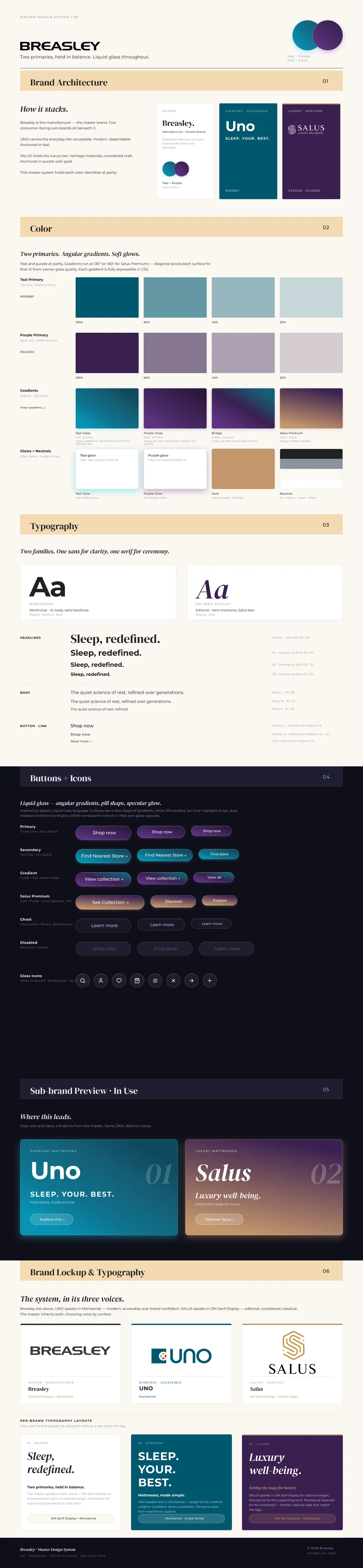
The master design system — scroll inside to explore the full sheet
And a search where there was none
The old site had no way to search — finding a mattress meant paging through category lists and guessing. The new finder narrows the full range by firmness, construction, and features like cooling and antimicrobial layers, and grades every mattress on the same soft-to-extra-firm scale — guided choice instead of guesswork.